Accordion #
The accordion field is a container field. It can define multiple input
fields, which are displayed as subform. The output is an array of dictionaries.
Accordion
Properties #
| property | value type | optional | description |
|---|---|---|---|
| key | string | mandatory | Keys are for internal use and must be unique |
| title | string | optional | The title of the accordion element |
| dynFormSearchKey | string | optional (default: null) | key of one of the child field of which the value refers to a custom partial form |
| dynFormObjectFile | string with relative path to file without file extension | optional (default: null) | if dynFormSearchKey is set this path points to the file containing a subform. Do not define the used file extension. Quiqr will automatically try to open json, toml or yaml files. If dynFormObjectFile is not set it refers to the partials in the ./quiqr/model/base file itself. |
| dynFormObjectRoot | string | optional (default: null) | if dynFormObjectFile is set this points to the root node where the subform is defined e.g. components |
| arrayIndicesAreKeys | boolean | optional (default: false | Enables read/write dictionaries which are actually arrays with keys as indeces |
| disableCreate | boolean | optional (default: false | Disables creating new items |
| disableDelete | boolean | optional (default: false | Disables deleting items |
| disableSort | boolean | optional (default: false | Disables sorting items |
| fields | array of dictionaries | mandatory | These are the form input fields. |
| fields.[n].arrayTitle | boolean | optional (default: false) | The value of the child field which has arrayTitle=true will be displayed as the accordion item title |
Disabled child fields #
if a child field of an accordion has a boolean field with a disabled and this
is set to true, the item will display light grey text to indicate it’s
disabled.
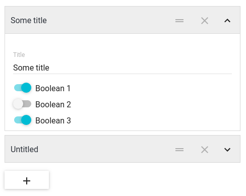
Sample 1: Regular accordion #
Configuration #
Below an example of a regular accordion configuration without dynamic forms.
./quiqr/model/base.
fields:
- arrayTitle: true
  key: title
  title: Title
  type: string
- key: boolean1
  title: boolean1
  type: boolean
- key: boolean2
  title: boolean2
  type: boolean
- key: boolean3
  title: boolean3
  type: boolean
key: my-accordion
title: accordion
type: accordion
key = "my-accordion"
title = "accordion"
type = "accordion"

[[fields]]
  arrayTitle = true
  key = "title"
  title = "Title"
  type = "string"

[[fields]]
  key = "boolean1"
  title = "boolean1"
  type = "boolean"

[[fields]]
  key = "boolean2"
  title = "boolean2"
  type = "boolean"

[[fields]]
  key = "boolean3"
  title = "boolean3"
  type = "boolean"
{
   "fields": [
      {
         "arrayTitle": true,
         "key": "title",
         "title": "Title",
         "type": "string"
      },
      {
         "key": "boolean1",
         "title": "boolean1",
         "type": "boolean"
      },
      {
         "key": "boolean2",
         "title": "boolean2",
         "type": "boolean"
      },
      {
         "key": "boolean3",
         "title": "boolean3",
         "type": "boolean"
      }
   ],
   "key": "my-accordion",
   "title": "accordion",
   "type": "accordion"
}
Output #
./data/sample.
my-accordion:
- boolean1: false
  boolean2: false
  boolean3: false
  title: some title
- boolean1: true
  boolean2: false
  boolean3: true
  title: second item
[[my-accordion]]
  boolean1 = false
  boolean2 = false
  boolean3 = false
  title = "some title"

[[my-accordion]]
  boolean1 = true
  boolean2 = false
  boolean3 = true
  title = "second item"
{
   "my-accordion": [
      {
         "boolean1": false,
         "boolean2": false,
         "boolean3": false,
         "title": "some title"
      },
      {
         "boolean1": true,
         "boolean2": false,
         "boolean3": true,
         "title": "second item"
      }
   ]
}
Sample 2: Accordion with dynamic forms defined in ./quiqr/model/base.yaml #
Configuration #
Fragments of the ./quiqr/model/base.yaml with a dynamic accordion and a partials section
./quiqr/model/base.
dynFormSearchKey: component_type
fields:
- arrayTitle: true
  key: title
  title: Title
  type: string
- key: component_type
  multiple: false
  options:
  - text: Poppy Banner
    value: poppy-banner
  - text: Poppy Shortlist
    value: poppy-shortlist
  title: Component Type
  type: select
key: page_sections
title: Page sections
type: accordion
dynFormSearchKey = "component_type"
key = "page_sections"
title = "Page sections"
type = "accordion"

[[fields]]
  arrayTitle = true
  key = "title"
  title = "Title"
  type = "string"

[[fields]]
  key = "component_type"
  multiple = false
  title = "Component Type"
  type = "select"

  [[fields.options]]
    text = "Poppy Banner"
    value = "poppy-banner"

  [[fields.options]]
    text = "Poppy Shortlist"
    value = "poppy-shortlist"
{
   "dynFormSearchKey": "component_type",
   "fields": [
      {
         "arrayTitle": true,
         "key": "title",
         "title": "Title",
         "type": "string"
      },
      {
         "key": "component_type",
         "multiple": false,
         "options": [
            {
               "text": "Poppy Banner",
               "value": "poppy-banner"
            },
            {
               "text": "Poppy Shortlist",
               "value": "poppy-shortlist"
            }
         ],
         "title": "Component Type",
         "type": "select"
      }
   ],
   "key": "page_sections",
   "title": "Page sections",
   "type": "accordion"
}
./quiqr/model/base.
dynamics:
- component_type: poppy-banner
  fields:
  - key: poppy_variant
    multiple: false
    options:
    - text: Full height
      value: header-banner-full-height
    - text: Regular
      value: header-banner
    title: Quiqr Variant
    type: select
  - key: bg_image
    title: Background image
    type: string
  - key: buttontxt
    title: Button text
    type: string
  key: poppy-banner
- component_type: poppy-shortlist
  fields:
  - key: text1
    title: Text 1
    type: string
  - key: text2
    title: Text 2
    type: string
  - key: text3
    title: Text 3
    type: string
  groupdata: true
  key: poppy-shortlist
  type: section
[[dynamics]]
  component_type = "poppy-banner"
  key = "poppy-banner"

  [[dynamics.fields]]
    key = "poppy_variant"
    multiple = false
    title = "Quiqr Variant"
    type = "select"

    [[dynamics.fields.options]]
      text = "Full height"
      value = "header-banner-full-height"

    [[dynamics.fields.options]]
      text = "Regular"
      value = "header-banner"

  [[dynamics.fields]]
    key = "bg_image"
    title = "Background image"
    type = "string"

  [[dynamics.fields]]
    key = "buttontxt"
    title = "Button text"
    type = "string"

[[dynamics]]
  component_type = "poppy-shortlist"
  groupdata = true
  key = "poppy-shortlist"
  type = "section"

  [[dynamics.fields]]
    key = "text1"
    title = "Text 1"
    type = "string"

  [[dynamics.fields]]
    key = "text2"
    title = "Text 2"
    type = "string"

  [[dynamics.fields]]
    key = "text3"
    title = "Text 3"
    type = "string"
{
   "dynamics": [
      {
         "component_type": "poppy-banner",
         "fields": [
            {
               "key": "poppy_variant",
               "multiple": false,
               "options": [
                  {
                     "text": "Full height",
                     "value": "header-banner-full-height"
                  },
                  {
                     "text": "Regular",
                     "value": "header-banner"
                  }
               ],
               "title": "Quiqr Variant",
               "type": "select"
            },
            {
               "key": "bg_image",
               "title": "Background image",
               "type": "string"
            },
            {
               "key": "buttontxt",
               "title": "Button text",
               "type": "string"
            }
         ],
         "key": "poppy-banner"
      },
      {
         "component_type": "poppy-shortlist",
         "fields": [
            {
               "key": "text1",
               "title": "Text 1",
               "type": "string"
            },
            {
               "key": "text2",
               "title": "Text 2",
               "type": "string"
            },
            {
               "key": "text3",
               "title": "Text 3",
               "type": "string"
            }
         ],
         "groupdata": true,
         "key": "poppy-shortlist",
         "type": "section"
      }
   ]
}
Output #
./data/sample.
page_sections:
- bg_image: img1.png
  buttontxt: ORDER NOW
  component_type: component1
  poppy_variant: header-banner-full-height
  title: some title
- text1: foo
  text2: bar
  text3: bar
  title: another page element
[[page_sections]]
  bg_image = "img1.png"
  buttontxt = "ORDER NOW"
  component_type = "component1"
  poppy_variant = "header-banner-full-height"
  title = "some title"

[[page_sections]]
  text1 = "foo"
  text2 = "bar"
  text3 = "bar"
  title = "another page element"
{
   "page_sections": [
      {
         "bg_image": "img1.png",
         "buttontxt": "ORDER NOW",
         "component_type": "component1",
         "poppy_variant": "header-banner-full-height",
         "title": "some title"
      },
      {
         "text1": "foo",
         "text2": "bar",
         "text3": "bar",
         "title": "another page element"
      }
   ]
}
Sample 3: Accordion with dynamic forms defined in a seperate file #
Configuration #
Fragments of the ./quiqr/model/base.yaml with a dynamic accordion.
./quiqr/model/base.
dynFormObjectFile: data/pageComponentsTree
dynFormObjectRoot: components
dynFormSearchKey: component_type
fields:
- arrayTitle: true
  key: title
  title: Title
  type: string
- key: component_type
  multiple: false
  options:
  - text: Component 1
    value: component1
  - text: Component 2
    value: component2
  title: Component Type
  type: select
key: page_sections
title: Page sections
type: accordion
dynFormObjectFile = "data/pageComponentsTree"
dynFormObjectRoot = "components"
dynFormSearchKey = "component_type"
key = "page_sections"
title = "Page sections"
type = "accordion"

[[fields]]
  arrayTitle = true
  key = "title"
  title = "Title"
  type = "string"

[[fields]]
  key = "component_type"
  multiple = false
  title = "Component Type"
  type = "select"

  [[fields.options]]
    text = "Component 1"
    value = "component1"

  [[fields.options]]
    text = "Component 2"
    value = "component2"
{
   "dynFormObjectFile": "data/pageComponentsTree",
   "dynFormObjectRoot": "components",
   "dynFormSearchKey": "component_type",
   "fields": [
      {
         "arrayTitle": true,
         "key": "title",
         "title": "Title",
         "type": "string"
      },
      {
         "key": "component_type",
         "multiple": false,
         "options": [
            {
               "text": "Component 1",
               "value": "component1"
            },
            {
               "text": "Component 2",
               "value": "component2"
            }
         ],
         "title": "Component Type",
         "type": "select"
      }
   ],
   "key": "page_sections",
   "title": "Page sections",
   "type": "accordion"
}
The complete object file in this case data/pageComponentsTree.yaml
data/pageComponentsTree.
components:
- component_type: poppy-banner
  fields:
  - key: poppy_variant
    multiple: false
    options:
    - text: Full height
      value: header-banner-full-height
    - text: Regular
      value: header-banner
    title: Quiqr Variant
    type: select
  - key: bg_image
    title: Background image
    type: string
  - key: buttontxt
    title: Button text
    type: string
  key: component1
- component_type: poppy-shortlist
  fields:
  - key: text1
    title: Text 1
    type: string
  - key: text2
    title: Text 2
    type: string
  - key: text3
    title: Text 3
    type: string
  groupdata: true
  key: component2
  type: section
[[components]]
  component_type = "poppy-banner"
  key = "component1"

  [[components.fields]]
    key = "poppy_variant"
    multiple = false
    title = "Quiqr Variant"
    type = "select"

    [[components.fields.options]]
      text = "Full height"
      value = "header-banner-full-height"

    [[components.fields.options]]
      text = "Regular"
      value = "header-banner"

  [[components.fields]]
    key = "bg_image"
    title = "Background image"
    type = "string"

  [[components.fields]]
    key = "buttontxt"
    title = "Button text"
    type = "string"

[[components]]
  component_type = "poppy-shortlist"
  groupdata = true
  key = "component2"
  type = "section"

  [[components.fields]]
    key = "text1"
    title = "Text 1"
    type = "string"

  [[components.fields]]
    key = "text2"
    title = "Text 2"
    type = "string"

  [[components.fields]]
    key = "text3"
    title = "Text 3"
    type = "string"
{
   "components": [
      {
         "component_type": "poppy-banner",
         "fields": [
            {
               "key": "poppy_variant",
               "multiple": false,
               "options": [
                  {
                     "text": "Full height",
                     "value": "header-banner-full-height"
                  },
                  {
                     "text": "Regular",
                     "value": "header-banner"
                  }
               ],
               "title": "Quiqr Variant",
               "type": "select"
            },
            {
               "key": "bg_image",
               "title": "Background image",
               "type": "string"
            },
            {
               "key": "buttontxt",
               "title": "Button text",
               "type": "string"
            }
         ],
         "key": "component1"
      },
      {
         "component_type": "poppy-shortlist",
         "fields": [
            {
               "key": "text1",
               "title": "Text 1",
               "type": "string"
            },
            {
               "key": "text2",
               "title": "Text 2",
               "type": "string"
            },
            {
               "key": "text3",
               "title": "Text 3",
               "type": "string"
            }
         ],
         "groupdata": true,
         "key": "component2",
         "type": "section"
      }
   ]
}
Output #
./data/sample.
page_sections:
- bg_image: img1.png
  buttontxt: ORDER NOW
  component_type: component1
  poppy_variant: header-banner-full-height
  title: some title
- text1: foo
  text2: bar
  text3: bar
  title: another page element
[[page_sections]]
  bg_image = "img1.png"
  buttontxt = "ORDER NOW"
  component_type = "component1"
  poppy_variant = "header-banner-full-height"
  title = "some title"

[[page_sections]]
  text1 = "foo"
  text2 = "bar"
  text3 = "bar"
  title = "another page element"
{
   "page_sections": [
      {
         "bg_image": "img1.png",
         "buttontxt": "ORDER NOW",
         "component_type": "component1",
         "poppy_variant": "header-banner-full-height",
         "title": "some title"
      },
      {
         "text1": "foo",
         "text2": "bar",
         "text3": "bar",
         "title": "another page element"
      }
   ]
}
Sample 4: Accordion for data that is stored in an array with keys as indices (Object used as Array) #
Configuration #
Below an example of a accordion configuration with the option arrayIndicesAreKeys enabled.
./quiqr/model/base.
arrayIndicesAreKeys: true
fields:
- arrayTitle: true
  key: title
  title: Title
  type: string
- key: boolean1
  title: boolean1
  type: boolean
- key: boolean2
  title: boolean2
  type: boolean
- key: boolean3
  title: boolean3
  type: boolean
key: my-accordion
title: accordion
type: accordion
arrayIndicesAreKeys = true
key = "my-accordion"
title = "accordion"
type = "accordion"

[[fields]]
  arrayTitle = true
  key = "title"
  title = "Title"
  type = "string"

[[fields]]
  key = "boolean1"
  title = "boolean1"
  type = "boolean"

[[fields]]
  key = "boolean2"
  title = "boolean2"
  type = "boolean"

[[fields]]
  key = "boolean3"
  title = "boolean3"
  type = "boolean"
{
   "arrayIndicesAreKeys": true,
   "fields": [
      {
         "arrayTitle": true,
         "key": "title",
         "title": "Title",
         "type": "string"
      },
      {
         "key": "boolean1",
         "title": "boolean1",
         "type": "boolean"
      },
      {
         "key": "boolean2",
         "title": "boolean2",
         "type": "boolean"
      },
      {
         "key": "boolean3",
         "title": "boolean3",
         "type": "boolean"
      }
   ],
   "key": "my-accordion",
   "title": "accordion",
   "type": "accordion"
}
Output #
./data/sample.
my-accordion:
  item1:
    boolean1: false
    boolean2: false
    boolean3: false
    title: some title
  item2:
    boolean1: true
    boolean2: false
    boolean3: true
    title: second item
[my-accordion]
  [my-accordion.item1]
    boolean1 = false
    boolean2 = false
    boolean3 = false
    title = "some title"
  [my-accordion.item2]
    boolean1 = true
    boolean2 = false
    boolean3 = true
    title = "second item"
{
   "my-accordion": {
      "item1": {
         "boolean1": false,
         "boolean2": false,
         "boolean3": false,
         "title": "some title"
      },
      "item2": {
         "boolean1": true,
         "boolean2": false,
         "boolean3": true,
         "title": "second item"
      }
   }
}